


Nothing derails a family photo faster than the “so what are we all wearing” text that goes unanswered for six days. I have been there, and I will tell you exactly how to solve it in about fifteen minutes of focused planning.
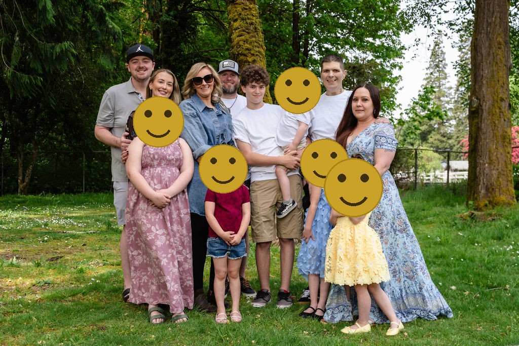
Coordinating outfits for a big family session does not mean everyone has to wear the same thing. In fact, please do not. Matching looks stiff, dated, and gives the whole group a team-uniform energy that is not what you are going for. What you want is a visual connection, not a uniform. A cohesive palette that reads as intentional without requiring everyone to shop at the same store on the same day.
Here is the formula that works for groups of four and groups of forty.
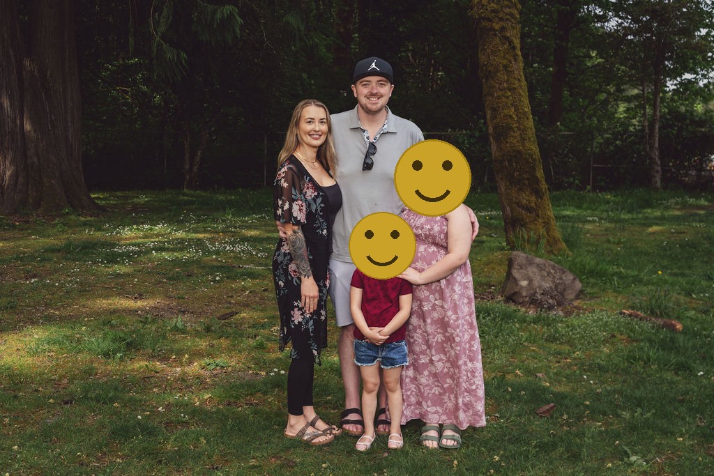
Start with a 3 to 4 color palette, not a single color
The foundation of outfit coordination for family photos is not picking a color for everyone. It is picking a small palette of colors that work together, and then letting each family member or family unit pick which one they wear.
The structure is simple: one anchor color that most people can find something in, plus one or two accent colors in the same warmth family. You end up with a palette, not a uniform.
Some palettes that photograph beautifully in the PNW:
Earthy and warm: Ivory or oat as the anchor, with rust, terracotta, sage green, and camel as accents. This palette glows at golden hour and works in every season, especially fall.
Classic and cool: Navy or charcoal as the anchor, with dusty blue, warm white, and a touch of burgundy. Clean, structured, and timeless on camera.
Jewel tones: Deep emerald, rich sapphire, burgundy, and gold together. This palette is bold and beautiful in PNW evergreen settings and photographs especially well in overcast light.
Soft and muted: Dusty rose, sage, oat, and warm tan. A quieter palette that works well for spring sessions and for groups who want something that feels relaxed rather than polished.
For a deeper look at colors that photograph well in the Pacific Northwest specifically, the guide to PNW family photo colors covers the specific choices and why they work in our light and landscapes.
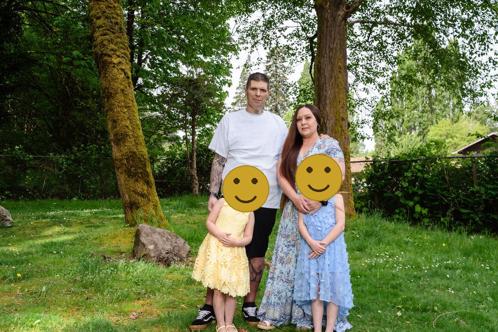
Use a connector color to bridge different family units
For multigenerational groups or large extended families, the challenge is often that two or three separate family units are trying to coordinate independently, and the result is that half the group ends up in warm tones and the other half in cool tones with nothing tying them together.
The fix is a connector color: one color that works with both warm and cool tones and acts as a visual bridge across the group. Blue is the classic connector. A dusty blue, navy, or medium chambray blue bridges warm rust AND cool sage without clashing with either. If you assign the connector color to whoever is the visual center of the group (often dad, often a teen, often someone who “does not care what they wear” and is easy to dress), the whole group snaps together.
Other connector colors that work: warm white, ivory, and certain medium greens (sage, eucalyptus, olive) can bridge warm and cool palettes depending on the specific shades involved. When in doubt, defaulting to an anchor neutral for half the group and letting accents fill the rest is almost always safe.
What to avoid
There are a few outfit choices that consistently cause problems in large group photos. Here is the short list:
Neon colors. Even one person in a bright neon orange, yellow, or lime green pulls all the visual attention in the frame. Neons also cast a subtle color shift onto nearby faces. Keep everyone in saturation ranges that are rich but not electric.
Large logos, graphics, and band tees. A graphic tee on one person is fine in the right context. In a family photo, it fights the eye and makes that person look disconnected from the group. Solid colors, subtle textures, and fine stripes all photograph better.
Busy plaids and large-scale patterns. Small stripes and fine patterns can work. Large plaids, bold geometric prints, and overly complex patterns compete with faces. The rule of thumb: if you can see the pattern clearly from across the room, it will read loudly in the photo.
All white for everyone. All-white looks good in one specific style of beach session and not much else. It washes out skin tones in bright light, shows every wrinkle and stain instantly, and flattens the group into a single visual blob rather than a family of individuals. Use white as an accent, not as the entire palette.
Too many competing pattern families. One person can wear a subtle stripe. Another can wear a fine plaid. But if three people have three different patterns, the frame starts to feel visually chaotic. Keep bold choices to one or two people maximum and let the rest anchor in solids.
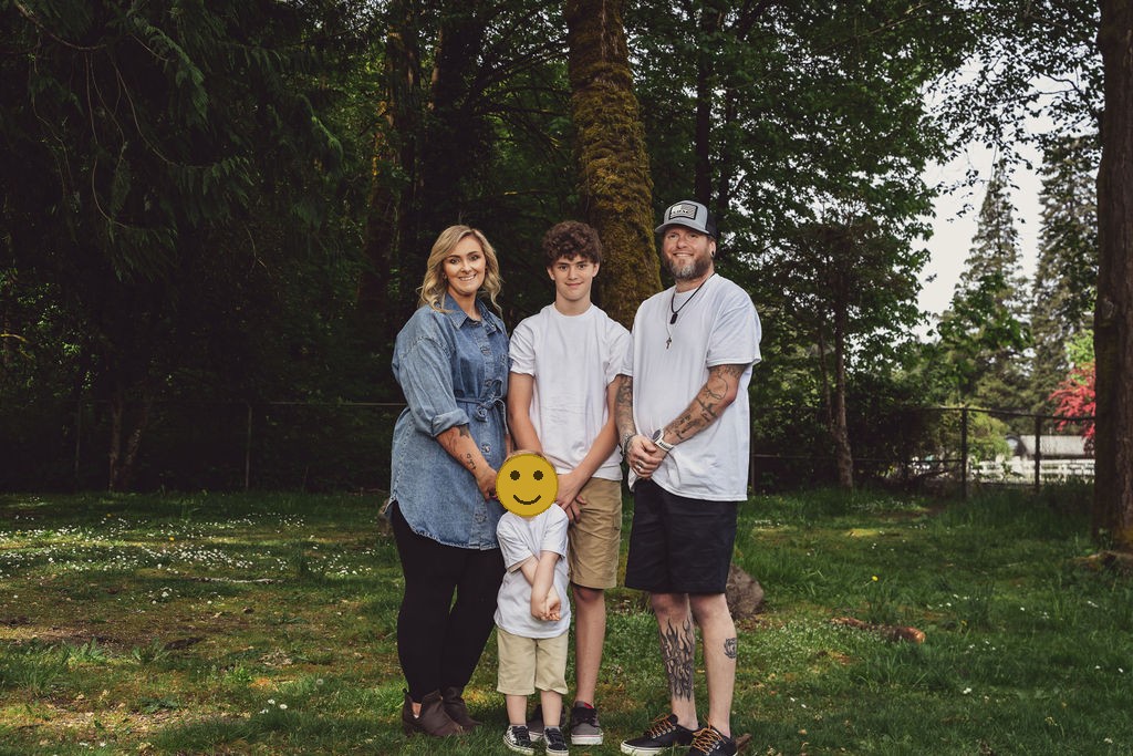
The outfit formula for each family unit within the group
For large groups with multiple family units (siblings with their own families, for instance), one practical approach is to assign each nuclear family unit a corner of the palette and let them coordinate within it.
Grandparent generation: Anchor color. Neutral, classic, something they already own and feel comfortable in. Do not ask grandparents to go shopping for one photo; meet them where they are and work it into the palette.
Parent generation: Anchor or accent colors. Structure and polish here photograph well. A blazer or a structured dress in the anchor color, or a clean rich jewel tone that anchors each couple.
Children: A smaller version of the parent palette. Kids do not need to match the adults exactly, just stay within the family palette. If parents are in navy and ivory, a child in a navy and white stripe or an ivory dress is perfect. Keeping children in softer, lighter versions of the palette keeps them from visually dominating the group while still connecting them to the whole.
Babies: Neutral whites and ivories almost always work. Babies are unpredictable and often need changes anyway. Putting a baby in something clean and neutral means a last-minute outfit swap does not break the palette.
For families with two separate family units joining (a blended family, or two sibling families coming together), the goal is visual connection, not visual identity. Each unit can have its own accent color as long as both accent colors live within the larger palette and the anchor color ties them together.
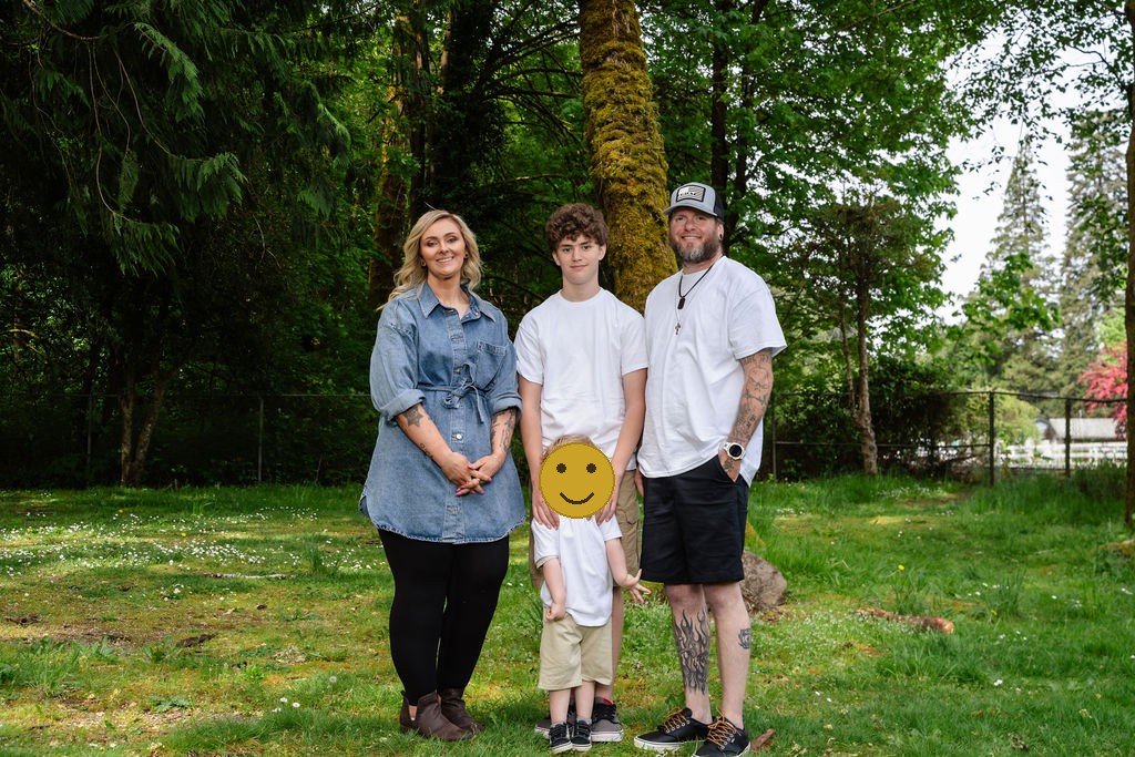
Fabrics and textures that photograph well
What you wear matters as much as what color you wear. In the PNW specifically, where sessions often run in mild temperatures with soft light, certain fabrics consistently photograph better than others.
Layers photograph beautifully. A linen button-down over a plain tee, a knit cardigan over a blouse, a structured jacket over a solid. Layers add dimension and visual interest without adding pattern. They also make a group look considered rather than accidental.
Textures read on camera. Knit, linen, velvet, and woven textures show up as richness in photos rather than flatness. A chunky knit sweater in the anchor color reads as intentional and warm; a thin, very smooth fabric in the same color can look a little flat and one-dimensional.
Avoid slippery and very thin fabrics. Lightweight polyester and very thin fabrics tend to wrinkle heavily on contact with grass, tree stumps, or anywhere you sit or lean during a session. The wrinkles read on camera. Natural fibers like cotton, linen, and wool blends hold up better over the course of a session.
Check the fit at home in the full outfit, not just the individual pieces. Tucking in a shirt, adding a belt, rolling the sleeves on a button-down, or adjusting a collar can make a significant visual difference. Do a mirror check in the full outfit before session day, not the morning of.
How to actually run the outfit coordination conversation
For large groups, one person needs to send the palette out and collect confirmations. Not a group text where everyone chimes in with opinions. A clear message with specific guidance and a deadline.
A simple approach: “We are shooting on [date]. Our palette is ivory and rust with sage green accents. Please wear something in one of those colors, no neons or large graphics. Confirm your outfits with me by [date a week before].”
For grandparents or family members who may not have something that fits the palette, the answer is almost always that a simple navy, white, or oat item from anywhere gets them close enough. Do not let outfit coordination become a reason someone skips the session. A grandparent in a slightly off-palette sweater who is present and smiling is worth infinitely more than the perfect palette with someone missing.
Build your mood board before your session with me and I will help you translate it into specific guidance you can send the family. Every Nautical Moments family session includes a custom mood board as part of the planning process so no one shows up guessing.
At Nautical Moments, a family session is a full portrait experience. The $299 session fee includes guided posing and direction, up to two hours together, a personal reveal session, and an 11×16 print (a $300 value). Additional images and products are available at your reveal, with no minimum purchase required.
Frequently asked questions about family photo outfit coordination
What colors look best in PNW family photos?
Earthy neutrals (ivory, oat, camel, tan), jewel tones (emerald, sapphire, burgundy), and warm accents (rust, terracotta, sage) all photograph beautifully in the Pacific Northwest’s soft, directional light. Avoid neons and high-contrast all-white. The PNW palette is generally rich, natural, and warm.
Should kids match the parents exactly?
No. Kids within the family palette is the goal, not kids dressed identically to the adults. A child in a softer or lighter version of the parent’s accent color works better than dressing everyone in the same item. It keeps the kids connected to the group while letting them look like kids, not small adults.
What about grandparents who want to wear what they want?
Work with it. Give the grandparent generation the broadest end of the palette (the neutral anchor) so they have the most flexibility to wear something they already own and feel comfortable in. A grandparent in a classic navy or a warm tan is almost always going to blend into any palette. Prioritize their presence and their comfort over perfect palette adherence.
How do I coordinate across two or three separate family units?
Use one anchor color for everyone and give each family unit a different accent color within the same warmth family. Anchor color ties everything together; accent color gives each unit a visual identity within the group. The connector color, assigned to one visual center of the group, bridges the units.
What is wrong with everyone wearing white?
All-white is very bright, shows stains instantly, and tends to wash out variation in skin tones. It flattens a group visually and requires perfect lighting to avoid blowing out the white in direct sun. Use white as one piece of the palette, not the whole thing.
Can we mix patterns?
One person in a fine stripe or a small print is fine. Two or three people in competing patterns starts to feel visually busy. Keep bold pattern choices to one or two people maximum and anchor the rest of the group in solids.
Ready to plan your session? Visit the family photography page to learn about the full experience and what a Nautical Moments session includes, then reach out to check your date and location. And for a complete look at what to wear season by season in the PNW, the Nautical Moments family photo style guide is the deep-dive companion to this post.


Fully guided sessions, a professional editing team behind every image, and a private reveal where you choose finished artwork for your walls. That is the difference between hiring a photographer and booking an experience.
Let’s bring your vision to life! Fill out the form below to ask any questions, share your story, or start planning your session. I’m here, ready when you are.


