


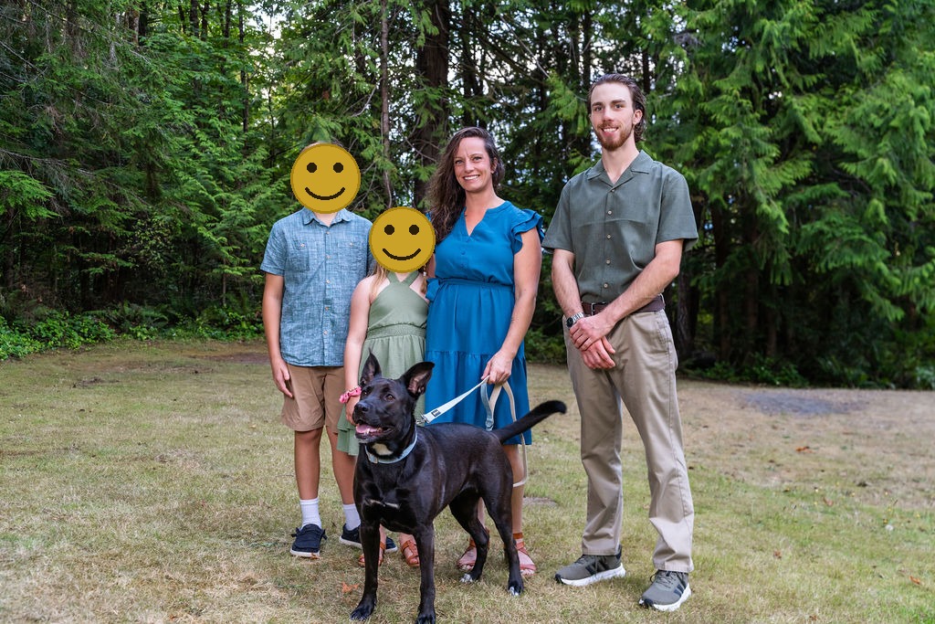
Picking what your family wears for photos can feel like defusing a bomb. Cut the wrong color and the whole gallery clashes. Relax and breathe, because no family has ever been lost to a rogue neon hoodie on my watch, and yours will not be the first.
Every family asks me some version of the same question: what colors should we wear? It is the thing parents stress about most, and the good news is that it is also the easiest to solve. Here in the Pacific Northwest we have a built in advantage, deep evergreens, driftwood beaches, and that soft gray light that flatters everyone. The trick is choosing colors that live in harmony with all of it instead of fighting it.
These are the five palettes I steer Kitsap families toward, why each one photographs so well here, how to build a palette without everyone looking like a uniform, and a quick note on what to skip. Stick with these and your photos will still feel current and timeless when you look back in ten years.
1. Sage and Olive Green
It feels almost too obvious, but greens melt into our forests and parks in the most natural, organic way. Sage, olive, and muted moss read calm and timeless, never loud, and they pair effortlessly with denim and warm neutrals for the rest of the family. Best for a forest or park session like Illahee Preserve, where the whole frame becomes one cohesive, earthy palette and nobody pops out unnaturally against the trees.
2. Dusty Slate Blue
Puget Sound is gray blue most of the year, and a soft slate or dusty blue echoes the water and sky instead of clashing with them. It is soothing, it photographs beautifully on overcast days, and it is an easy sell for families with a few people who refuse to wear anything but blue. Best for a waterfront session at a spot like Lions Park or Silverdale Waterfront Park, where the tones tie straight into the backdrop.
3. Cream and Oatmeal Neutrals
When in doubt, go soft. Cream, oatmeal, taupe, and warm white never compete for attention, which keeps the focus on your faces and the connection between you. Neutrals also age the best, so the photos still feel current in ten years instead of screaming a particular trend. Best for any season and any location, and the safest starting point if you are building a look around little ones who will inevitably get a snack on their outfit.
4. Rust and Mustard (Warm Earth Tones)
Our gray autumn light makes warm earth tones glow. Rust, terracotta, mustard, and burnt orange pop against fall foliage and add warmth on a moody day without ever feeling neon. They photograph like a hug. Best for an autumn session, especially paired with the changing leaves around Kitsap in October, and gorgeous for holiday card photos.
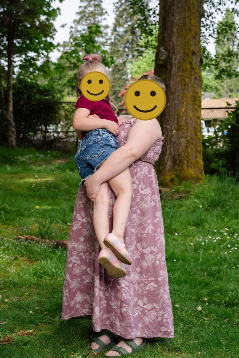
5. Mauve and Dusty Rose
A gentle, dusty pink brings warmth and softness against all that PNW green, and it flatters nearly every skin tone. It is a favorite for spring and for families who want a little color without going bold. Best for a spring meadow or blossom session, and it mixes beautifully with cream and soft gray for the rest of the crew.
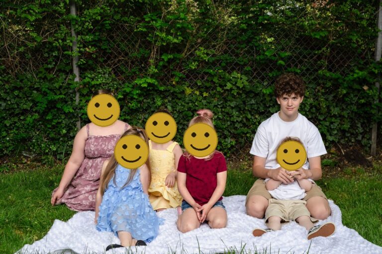
Matching head to toe in identical white shirts and khakis is a classic look, mostly because it makes everyone resemble a very polite cult on vacation. We can do better than that, I promise.
How Do You Build a Family Palette Without Everyone Matching?
Coordinated always beats matchy. The matchy look, where everyone wears the identical white shirt and jeans, tends to read stiff and dated. Here is the easy way to coordinate instead:
- Start with one person. Usually mom. Pick her outfit first, then build everyone else around that range of tones.
- Choose two or three colors from the palettes above and let each person pull from that range, not the exact same shade.
- Add texture for depth. Knits, linen, corduroy, and denim photograph richer than flat cotton and keep a neutral palette from looking plain.
- Keep patterns to one person. A single soft plaid or floral can anchor the group, but two or three competing patterns get busy fast.
- Layer it up. A cardigan, jacket, or scarf adds a second tone and is a lifesaver when our weather changes mid session.
For the full breakdown with examples, see our family photo style guide, and The Knot’s family outfit ideas are a helpful visual reference too.
What Colors Should You Wear by Season in Kitsap?
Our backdrop changes through the year, so the palette that sings in October is not the one that sings in May. A quick cheat sheet:
- Spring: mauve, dusty rose, soft cream, and sage. They play off blossoms and fresh green without overpowering them.
- Summer: dusty slate blue, cream, and light sage. Cooler tones feel right against bright water and long evening light.
- Fall: rust, mustard, olive, and warm cream. The whole earth tone family glows against changing leaves.
- Winter: deep slate blue, charcoal, cream, and a touch of deep green. Richer, moodier tones suit our gray winter light and look classic on a holiday card.
What Colors Should You Avoid for PNW Family Photos?
A few things consistently fight our soft light and pull the eye away from your faces:
- Neon brights. Hot pink, electric blue, and bright red overpower everything around them and cast colored light onto skin.
- Big logos and busy graphics. They date fast and grab attention that should be on your family.
- True all white or all black head to toe. White can blow out in bright light and black can flatten into a void. Swap white for cream and break up black with a softer accent.
- Everyone in the exact same color. It reads like a team uniform. Coordinate within a palette instead.
Do Family Photo Colors Need to Flatter Skin Tones?
They help, but you have more freedom than you think, because the palettes above are already gentle, low saturation tones that flatter nearly everyone. A couple of light touches go a long way. If your family has cooler undertones, slate blue, sage, and cream sit especially well. If you run warmer, rust, mustard, and oatmeal will make skin look healthy and glowing. The one thing to watch is a color worn right up at the neckline that washes someone out, like a cold bright white on very fair skin or a muddy tone on deeper skin. When in doubt, move the boldest color to a layer or a bottom and keep the softest tone near the face. And remember our gray PNW light is naturally flattering and even, so it does a lot of the work for us before I ever pick up the camera.
Three PNW Palette Combinations You Can Copy
If you want to skip the guesswork entirely, here are three tried and true combinations that photograph beautifully against our Kitsap backdrops. Pull your family’s outfits straight from one of these:
- The Forest: sage green, cream, and warm denim. One person in sage, one in cream, the rest in soft denim and oatmeal. Effortless against trees and ferns, and it works in every season.
- The Shoreline: dusty slate blue, soft gray, and cream. Echoes the water and sky at any of our waterfront parks, and it stays calm and timeless on a holiday card.
- The Harvest: rust, mustard, cream, and olive. The autumn powerhouse. Put the boldest tone on one person and let everyone else support it with neutrals and a touch of green.
Notice the pattern in all three: one or two tones carry the look, and neutrals fill in the rest. That balance is what keeps a family photo from feeling either too plain or too busy. When you book, send me a quick photo of your laid out outfits and I will tell you if anything is fighting before we ever step on location.
Family Photo Color FAQ
Should everyone match exactly? No. Pick a palette of two or three colors and let each person wear their own piece within it. Coordinated beats matchy every time.
What colors are best for a fall session? Warm earth tones, rust, mustard, olive, and cream, which glow against autumn foliage and gray light.
Do white shirts and jeans still work? They can, but they read a little dated and stark. Swap white for cream and add one accent color for a richer, more current look.
What if my family will not all agree on colors? Pick the palette yourself, then send everyone two or three options within it. People are far happier choosing from a small set than being told exactly what to wear.
How do I dress a baby or toddler for photos? Start with the little ones in the softest neutrals and build the adults around them. Avoid bright character prints, and pack a backup outfit in the palette in case of spills.
Do you help with this before the session? Yes. Picking your palette and the right spot is part of every session I shoot, so you never have to guess alone.
At the end of the day, do not overthink it. Pick a palette you genuinely like, coordinate within it, and let our greenery and soft light do the rest. The families who relax about their outfits are almost always the ones who love their photos most, because the focus lands where it belongs, on the people and not the clothes.
Want help picking your palette and the perfect spot? Browse the best parks for family photos in Kitsap, see the best time of year to shoot, then reach out to plan your family session.
The Nautical Moments portrait experience
Worth knowing as you plan: a session with Nautical Moments is a full portrait experience, not a quick photo op. The $299 session fee includes guided direction, up to two hours, and a personal reveal where we help you choose your favorites, plus an eleven by sixteen print, a $300 value, so you leave with finished wall art and not just files on a phone. Family sessions include up to two outfits, one classic and one dressy, and we create a custom mood board to help you choose looks that photograph beautifully. Additional images and products are available at your reveal, and there is never a minimum to buy.
Ready to plan your Kitsap family session?
We would love to help you plan a relaxed, beautiful family session, from choosing colors that photograph well to guiding you through every pose on the day. Book your family session or get in touch to start planning. We will help you create artwork your family treasures for years to come.


Fully guided sessions, a professional editing team behind every image, and a private reveal where you choose finished artwork for your walls. That is the difference between hiring a photographer and booking an experience.
Let’s bring your vision to life! Fill out the form below to ask any questions, share your story, or start planning your session. I’m here, ready when you are.


