


Neon might be your whole personality, but it is not your senior photos’ best friend. Trust me, the color you choose will do more for your pictures than any pose. The good news is that picking the best colors to wear for senior pictures in the Pacific Northwest is simple once you know what our evergreen backdrops and gray skies actually love.
Short answer up top: the best colors to wear for senior pictures here are solids, jewel tones, and warm neutrals. Save the neon for the beach bag. Here is why, and how to build a color story that looks like nobody else’s.
The Best Colors to Wear for Senior Pictures That Pop in the PNW
The best colors to wear for senior pictures in our region are the ones that stand apart from all that green and gray. Reach for these:
Free planning tool
The Class of 2027 Kitsap Senior Photo Planner
The yearbook deadline tracker for every Kitsap area school, real golden hour dates for Bremerton, the booking timeline from now to graduation, and a style quiz for your senior. We will email it to you, plus an alert when your school publishes its real deadline this fall.
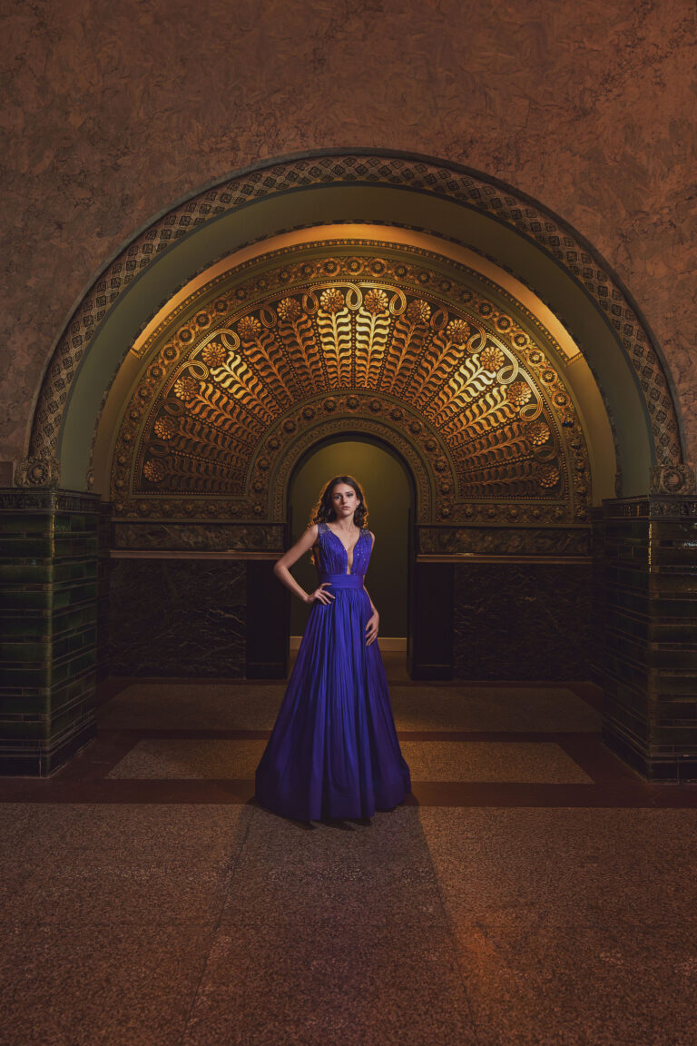
- Jewel tones. Emerald, navy, deep burgundy, and mustard glow against evergreens and overcast skies. They read rich, not loud.
- Warm neutrals. Cream, camel, and soft rust feel timeless and keep the focus on you.
- Winter white. A crisp white or ivory pops beautifully against a moody forest or a gray Puget Sound backdrop.
Colors to Skip, and Why
- Neon. Bright fluorescents bounce color onto your skin and pull the eye away from your face.
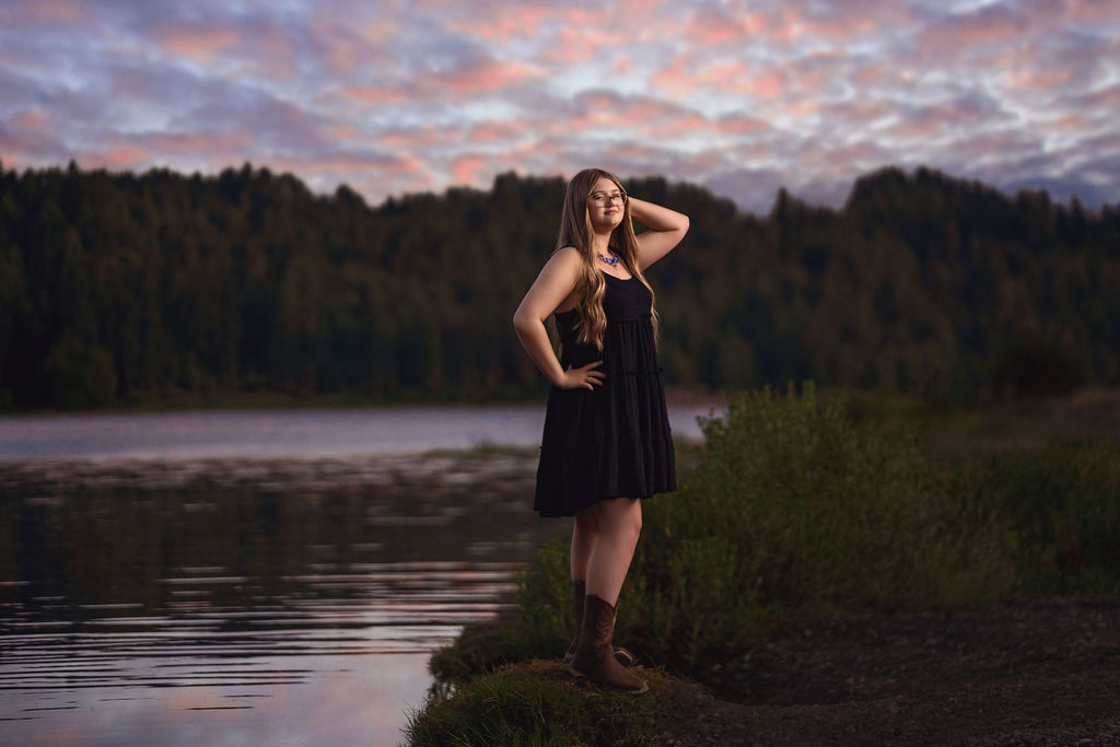
- Pure black. It can go flat and featureless in soft PNW light. Navy usually reads better while still feeling classic.
- Green on green. Olive or forest green tends to disappear straight into our trees.
Match Your Colors to You
A quick gut check without overthinking it. A quick color analysis primer can help if you are unsure. If gold jewelry and warm tones suit you, lean into camel, rust, and emerald. If silver and cooler tones are more your thing, navy, burgundy, and true white will sing. When in doubt, a rich jewel tone flatters almost everyone.
Build a Color Story Across Your Looks
Because our sessions include up to five outfit changes, you get to tell a color story instead of repeating one look. Coordinate your outfits so they complement rather than match, for example a jewel tone, a neutral, and a white, so the whole gallery feels intentional. For the full breakdown, see our senior picture outfit guide and this year’s senior picture trends.
Best Colors by Where You Shoot
The right color also depends on your backdrop. Since we can visit multiple locations in one session, here is how to think about color by setting.
- Evergreen forest. Warm tones and jewel tones pop against deep green. Think mustard, rust, burgundy, and cream, and skip olive or forest green so you do not blend into the trees.
- Waterfront and beach. Puget Sound gives you cool blues and grays, so warm colors like camel, coral, and gold create beautiful contrast, while crisp white glows in the open light.
- Downtown Tacoma and urban walls. Brick, concrete, and moody backdrops love bold saturated color. This is where a true red, emerald, or cobalt really sings.
- Studio or covered. A clean backdrop lets any jewel tone or rich neutral take center stage without competing with the scenery.
A Season by Season Color Guide for the PNW
Our light and scenery shift through the year, and your colors can follow along.
- Fall. The best season for warm color. Rust, mustard, deep green, and burgundy echo the turning leaves and feel rich in golden autumn light.
- Winter. Lean into moody contrast. Winter white, deep navy, and jewel tones stand out against bare trees and gray Puget Sound skies.
- Spring. Soft and fresh. Muted tones, a sage paired with a neutral, and cream feel light without washing out in the bright overcast.
- Summer. Clean and bright. White, camel, and a single saturated pop look effortless in our long golden evenings.
Coordinating Colors With Props and Activities
Many seniors bring something that represents them, whether that is a letterman jacket, an instrument, sports gear, or a beloved pet. Build your color around it. If your team colors are bold, keep the rest of your outfit neutral so the two do not fight. If your prop is neutral, that is your chance to wear a rich jewel tone. The goal is a photo that looks like you, not a color collision.
What About Patterns and Prints?
Solids photograph best because they keep the focus on your face, but a subtle pattern can add interest in one of your looks. Keep prints small to medium, avoid tight stripes and busy logos that distract on camera, and never wear a pattern that is louder than you are. A denim jacket layered over a jewel tone top is a perfect middle ground.
How Many Colors Should One Look Have?
Keep each individual outfit to one or two colors plus a neutral. A senior in a single emerald dress reads clean and confident. A senior wearing emerald, orange, and purple all at once pulls the eye in three directions at the same time. If you love color, spread it across your looks instead of stacking it into one.
Colors When Someone Joins Your Session
Some seniors bring a best friend, a sibling, a parent, or a pet for a few frames, and that changes the color math. Instead of matching exactly, coordinate within the same family of tones. If you are in burgundy, your friend in navy or cream complements you without competing. Head to toe matching looks dated, while complementary colors look intentional and modern.
A Quick PNW Color Cheat Sheet
If you only remember one thing, remember this. Jewel tones and warm neutrals almost always work here. White pops against evergreen and gray. Neon and pure black are the two to think twice about. Everything else comes down to matching the color to your backdrop, your season, and you.
How to Test Your Colors Before the Session
You do not have to guess. In the days before your session, hold each outfit up in natural light near a window and snap a quick phone photo of yourself. The camera sees color differently than your mirror, and a two minute test will tell you fast whether a shade brightens your face or drains it. Lay your looks out side by side too, so you can see whether they tell one cohesive story or clash. And when in doubt, bring the maybe outfit anyway. It is far easier to leave a look in the car than to wish you had options once we are on location.
Trust Your Photographer’s Eye
Finally, do not overthink it. Bring the colors you love and a few options, and let me help you choose on the day based on the light and the location we are standing in. Part of my job is reading how a color reacts in the moment and steering you toward the looks that will make your gallery shine. You focus on feeling like yourself, and I will take care of the rest.
Do Not Forget Texture and Season
Color is the headline, but texture is the supporting act. A chunky knit sweater, a denim jacket, or a soft corduroy adds depth that a flat fabric cannot, and it photographs beautifully in our diffused Pacific Northwest light. Think about the season too. Fall loves rust, mustard, and deep green tones that echo the changing leaves, while spring and summer sessions shine with crisp white, soft camel, and a single jewel tone pop. Layering also gives you a built in outfit change, since adding or removing a jacket instantly shifts the mood between two of your looks.
Do my colors need to match the season?
Not at all, but leaning into the season can make your photos feel cohesive. Fall loves warm earth tones, winter loves jewel tones and white.
Can I bring my school or team colors?
Yes. Feature them in one look and keep your other outfits neutral or complementary so the gallery still feels varied.
Our senior experience is designed to feel like a personal shoot, not a rushed sitting. It includes a planning call, up to five outfit and color changes, session time across your favorite locations, and a reveal appointment with an 11×16 print, a package valued around $300 and starting at $299.
Frequently Asked Questions
Can I wear black for senior pictures?
You can, but navy often photographs better in our soft light. If you love black, pair it with texture or a pop of color so it does not go flat.
Are bright colors okay?
True, saturated colors like emerald or red are great. It is only neon fluorescents that cause problems by casting color on your skin.
What colors match my skin tone?
Warm undertones love camel, rust, and mustard. Cool undertones love navy, burgundy, and white. Jewel tones are a safe bet for everyone.
Should each outfit be a different color?
Coordinate, do not repeat. A jewel tone, a neutral, and a white across your looks makes the gallery feel like a real story.
Let’s Plan Your Colors Together
Not sure which colors are you? That is exactly what our planning call is for. As your Bremerton senior photographer, I will help you build an outfit and color plan before your session so every look feels confident. Book your senior session and let’s make it happen.
Keep planning your session
Color is only one piece of the look. Here is the rest of the senior session planning we recommend:


Fully guided sessions, a professional editing team behind every image, and a private reveal where you choose finished artwork for your walls. That is the difference between hiring a photographer and booking an experience.
Let’s bring your vision to life! Fill out the form below to ask any questions, share your story, or start planning your session. I’m here, ready when you are.


